Raemian by Samsung C&T undergoes first brand renewal in five years, declares a "life of greater depth"
- Input
- 2026-08-31 12:01:52
- Updated
- 2026-08-31 12:01:52
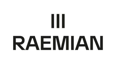
In line with the shift in philosophy, the company also refreshed its new Brand Identity (BI). The three vertical lines that symbolize Raemian were retained to preserve its identity, while the design was simplified to emphasize spatial depth and empty space. In particular, the existing green and gray color scheme was replaced with restrained black and white, reflecting its commitment to focusing fully on the essence of housing rather than on extravagance.
The new BI was developed in three wordmark versions: English, Korean and Chinese characters. It uses a bolder typeface and more precise letter spacing to enhance stability. The new BI will first be applied to Raemian Triniwon in Banpo-dong, Seocho-gu, Seoul, where move-ins recently began, and will be gradually expanded to new complexes scheduled for future sales.
Samsung C&T said the renewal will not stop at a simple logo change. It plans to extend the effort into differentiated products and service innovation, including the flexible-structure "Next Home," the landscaping brand "Nature Gallery" and the residential service "Hestia."
Kim Myung-seok, head of the housing product marketing division at Samsung C&T, said, "This renewal is a process of inheriting Raemian's heritage built over the past 26 years while redefining the standards that will lead the next 100 years in line with changing housing values." He added, "We will continue to grow as a brand that makes each customer's life deeper and richer through differentiated products, services and technology."
[email protected] Jeon Min-kyung Reporter