"All-time tacky" vs "looks insane in person"... Leaked Son Heung-min kit sets the internet ablaze
- Input
- 2026-01-12 10:37:57
- Updated
- 2026-01-12 10:37:57
The new armor of the South Korea national football team under Hong Myung-bo, which is charging toward the 2026 FIFA World Cup, has been unveiled through a leak.
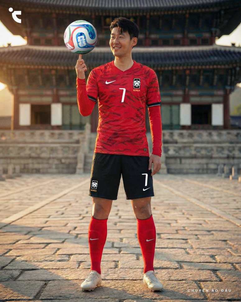
The first impression is anything but ordinary. Even the mock-up image of "captain" Son Heung-min wearing the kit has triggered intense debate among fans.
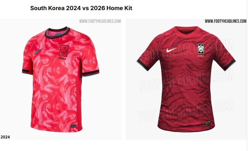
Football kit specialist outlet Footy Headlines on the 11th (Korea time) released the projected design of the South Korea national football team’s home kit for the 2026 FIFA World Cup.
The defining feature of this leaked design is its "wild" character. The images show a bold break from the simple, mostly solid-color look that has been maintained over the past few years.
The irregular diagonal patterns etched over the deep red base are meant to evoke the rugged mountain ranges of the Korean Peninsula, while visually recreating the texture of tiger skin, the eternal symbol of Korean football.
The change in color tone also stands out. Instead of the highly saturated red that was criticized at recent World Cups as looking like a "highlighter" or "hot pink," a heavier, more sober "global red" has returned.
Black cuffs at the end of the sleeves add a sense of strength, while the gold outline around the Nike logo is seen as lending a touch of sophistication to a design that might otherwise have looked a bit rough.
The problem is the sharply divided opinions. Because of the bold patterning, fan reactions are swinging between extremes.
Supporters of the design are cheering, saying, "We finally got rid of the pink skin-tight look," "It’s better than the Hanwoo marbling edition," "You can feel the overpowering energy of the tiger," and "The combination of black and deep red feels classic and authentic."
In particular, many fans are pleased with the deep red that evokes nostalgia for 2002.
On the other hand, there is no shortage of negative reactions. Online communities are filled with comments such as, "The pattern is too busy and hard to make sense of," "From a distance it just looks like stains," and "It only looks that good because Son Heung-min is wearing it; ordinary people will struggle to pull it off."
Some go further, saying, "The over-the-top design actually makes it look tacky," and "It even looks like hiking gear."
The controversial kit is expected to be officially used from the International 'A' Match window in March. The question now is whether the "on-pitch presence" of players drenched in sweat will be enough to turn fans’ worries into cheers. The journey toward North and Central America has already begun amid a heated debate over the kit design.
jsi@fnnews.com Jeon Sang-il Reporter